
How to make your landing page a huge success
Today, having a website is key. If you don’t have a website today, it’s like your business doesn’t even exist.
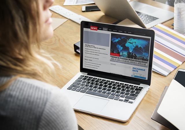
Your website works as the hub of your business’s internet activity and the place where most people will find their way to when looking up your business online.
But your website is so much more than just communicating with your current customers.
Your website can be a money making machine if used correctly, and today, there are plenty of businesses that have zero physical boutiques or stores, and are solely leveraging the internet and their website for selling their products.
As the internet has evolved, it has come to play a central role in most marketer’s marketing strategies. Today, many businesses almost solely work with marketing efforts online and have stopped using traditional print and display marketing which was the center of attention back in the days.
But if you’re using online marketing tactics, whether it be SEO, Pay per click or online advertising, you need to create landing pages. If you aren’t you’re missing out.
A large portion of brands that are working with online marketing to get people to their website to ultimately get them to convert are completely neglecting landing pages, and doing so also means missing out on a lot of money.
What are landing pages?
Let’s begin by getting some context to the landing page.
A landing page is a page on your website that is created for a specific marketing campaign. As per Google’s Dictionary, a landing page is defined as “a web page which serves as the entry point for a website or a particular section of a website”.
In other words, a landing page is a page on your website that is focused on a specific topic and for brands most often a specific product. The whole page is then focused on this product, and this is done to make the online advertisement that drew the visitor there get more context and coherence, and get to the thing they are interested in, without actively having to look for it.
Essentially, creating a landing page means improving the user experience of your website visitors. The simple answer to why you should use them is that, ultimately, they increase your conversion rates, and isn’t that your ultimate goal?
Most brands, when running an online marketing campaign focus on driving people to their website in order to get them to buy from them, and where do you think they take the visitors?
You guessed it right, to their website’s front page. In fact, according to MarketingSherpa’s Landing Page Handbook, 44% of the visitors to B2B companies are directed to their sites’ homepage.
Why is this a bad idea?
Well, when working with online marketing to get people to your website, the vast majority of people will be completely unfamiliar with your business. At the same time, you have created a campaign that is focused on a specific product or topic. This means that the individuals that come to your website have come to your website because they are interested in the thing that you have promised that you have.
The problem with taking these people to your website’s front page is that they’ll feel lost and don’t know how to navigate.
Let’s say that you’ve run an ad for a t-shirt and then people come to your site because they have been inspired to buy that exact t-shirt. But if they come to your front page, it means that they have to actively look for that shirt, and it might lead to them not finding them. As a result, they will most likely leave your website – forever. This translates into not only lost revenue but if you’ve paid for an advertisement to get them there, it translates into money that you wasted.
With all of this in mind, it’s easy to see why landing pages are crucial for successful marketing campaigns. It’s also easy to see how they can have a huge effect on how well your online marketing campaigns perform.
Let’s look at five ways you can create a landing page and make it a huge success.
1. Leverage signup forms
A crucial part of your landing page is the sign-up form or at least a call-to-action button. If you take a look, you’ll notice that all landing pages have either only a CTA button, or both a sign-up form and a call to action button (as forms and CTA buttons go hand-in-hand).
Despite the importance of sign up forms, there are many brands that neglect it. Some people neglect it because they just don’t know how to create one, and that’s understandable. Creating a signup form is hard. Unless you’re using SendPulse, that is.
With Sendpulse, you can effortlessly create a signup form within a matter of seconds using the easy-to-use interface and the different elements available.
It is completely customizable, and you’ll have full control over every single element you add or don’t add to it. When creating it, make sure your signup form is clear, concise, and gives an offer that resonates with the rest of your landing page and the advertising campaign you ran to get people there.
2. Send triggered emails at different stages of your sales funnel
While we all wish it would be so easy to get a conversion to just get people to your landing page and that’s it, that’s seldom the case.
Often times, landing pages aren’t used to get instant sales, but instead, they are often created to get people to sign up and give their email address in order for the brand to then move the prospect further down their conversion funnel.
If this is the way you’ve used your landing page, it is when people sign up using your signup form that the real job starts, as now, you need to actively work to ultimately get them to convert.
The best way to do this through email is to set up triggered emails that are sent out throughout different stages of the conversion funnel.
Doing this manually is a lengthy and time-consuming task, to say the least, but using SendPulse, you can automate this complete process, so you can ensure that the right emails are sent to the right people at the right time.
With Automation 360, you can have triggered emails sent out at these events, which means stages of the sales funnel:
- Abandoned Cart
- Purchase
- Registration
- Custom event
Most importantly, in this case, is the custom events that gives you complete control over when you want emails to be triggered and sent out to your new prospects. Make sure you create events that are relevant to the recipients and that the message resonates with the stage of the sales funnel that they are in.
3. Matching looks – throughout the whole process
When designing your landing page, it is crucial that it aligns with the visual appearance of the advertising that first got people there. Further, you also want to make sure that the subscription form aligns with the visual appearance of the rest of your landing page, and lastly, when sending out your marketing emails to get people further down your conversion funnel, it is vital that these emails resonate with the rest of the messaging that you’ve been feeding your prospects throughout the whole journey.
Humans love when things feel familiar as we tend to feel much more at home and comfortable, and this is something you want to put great emphasis on throughout the whole process – from finish to start.
Fortunately, doing this doesn’t have to be complicated, and with SendPulse’s email template editor, you have full control over how your email looks and how it is structured. Use the email editor to craft emails that feel familiar to the recipients and you’ll notice a much higher interaction rate and ultimately also conversion rate. This goes in both ways because if you send out an email which leads people to your landing page, they’ll instantly know they’re in the right spot if looks the same.
4. Keep forms short
Subscription forms that are shorter and ask for less information see a much higher conversion rate than long subscription forms. This is not very surprising as people want things to go fast and pain-free, and if they have to spend a ton of time filling out information, many people will be discouraged to do it. In fact, a study found that forms with three fields have a conversion rate of 25%. And the more fields are added, the more this number decreases.
Make it easy to sign up through your form and you’ll see a higher conversion rate. With SendPulse’s subscription forms, you can decide exactly how many or how few fields you want to have.
5. Optimize your buttons
Call-to-action buttons are incredibly important for your landing page in order to get people to do what you want them to do, but it’s simply not enough to just throw up a CTA button and then leave it there.
In fact, the way your CTA button looks, and the way it resonates (and contrasts) all of your other content on your landing page can actually have a huge effect on your landing page.
But the thing with CTA buttons on your landing page is that there are no universal hacks for a well-performing button because it depends on so many variables. Therefore, you need to actively change it and optimize in order to find the best performing button for you. Just know that small changes can result in big improvements your button’s performance.
In fact, a brand saw a 26% increase in clicks by simply adding an arrow icon to their CTA buttons. Furthermore, another brand found that just by making their CTAs red lead to a boosted conversion rate of 21%.
Using SendPulse’s subscription form, you have complete power over the CTA buttons that you use on your landing page. Not only do you have full control and power over how it looks, but changing and optimizing it is also incredibly easy. This is ideal as when you work with optimizing your landing page’s conversion rate, you’re not just going to change things one or two times, and therefore, you want things to run as smoothly as possible.