
Tips and Tricks to Create Effective Signage for Your Business
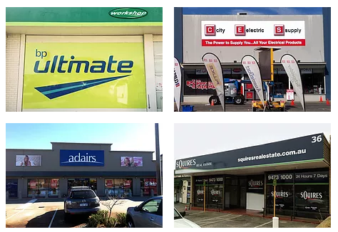
When placed in the right location, outdoor signage can deliver a wealth of excellent benefits for your business, including greater visibility and exposure, bringing in more customers, reaching markets that other advertising mediums are unable to, and reinforcing the availability of the business brand.
However, to achieve benefits like those above, signage in Perth needs to be effective, so use these tips and tricks to create effective signage for your business and enhance its visibility in ways you never thought possible.
Avoid Clutter and Make Use of White Space
Cluttered signs are forgettable signs, which means you need to avoid clutter and make the best possible use of the white space (the background) that you possibly can. Your business name, logo and contact information (keep this short and sweet) are all that you need on your sign.
There’s no need for an address as the sign is above or beside your door and you use other signage products such as window signs and shopfront signs when you need to advertise a special or plug a discount that you’re offering local customers. https://www.totalsignco.com.au is a great website to get some cool ideas for business signage that delivers the kind of outcomes businesses want to see.
Use the Right Fonts and Colours
Most businesses will want to use their logo colours on their sign and that’s fine. However, you still need to pay attention to the fonts that you use and the way you position the text on the sign with regard to foreground and background colours. The Outdoor Advertising Association of America (OAAA) has listed the best colour combinations for readability at a distance, with the following the top three colour combinations:
- Black on yellow
- Black on white
- Yellow on black
As you can see, there’s not a lot of variety here, but what you should notice is how each combination combines a dark colour with a contrasting light colour. Contrast is very important when it comes to outdoor signage as it aids readability, and that’s very important as you want your sign and its message to be read by those who see it. And on that note, you also need to consider the size of the font that you use.
Size Matters!
What it comes down to is the larger the lettering, the easier a sign is to read. Unless you’re standing directly under a very large sign which presents its own challenges! Think about where people will see the sign from and make sure the lettering is large enough to be seen from that distance, moreover, don’t forget to take into account the font that you’ve used as well, as some fonts are more difficult to read at a distance than others.
Using tricks and tips such as avoiding clutter and making good use of white space, using the right fonts and colours and making the message large enough to be seen from afar can help you to create effective signage for your business that maximises visibility in your local area.